We use WhatsApp status daily — to share moments, thoughts, or memories — but the experience of posting one isn’t exactly seamless. I explored how it could be improved from a user accessibility and feature standpoint.
The Original Screen
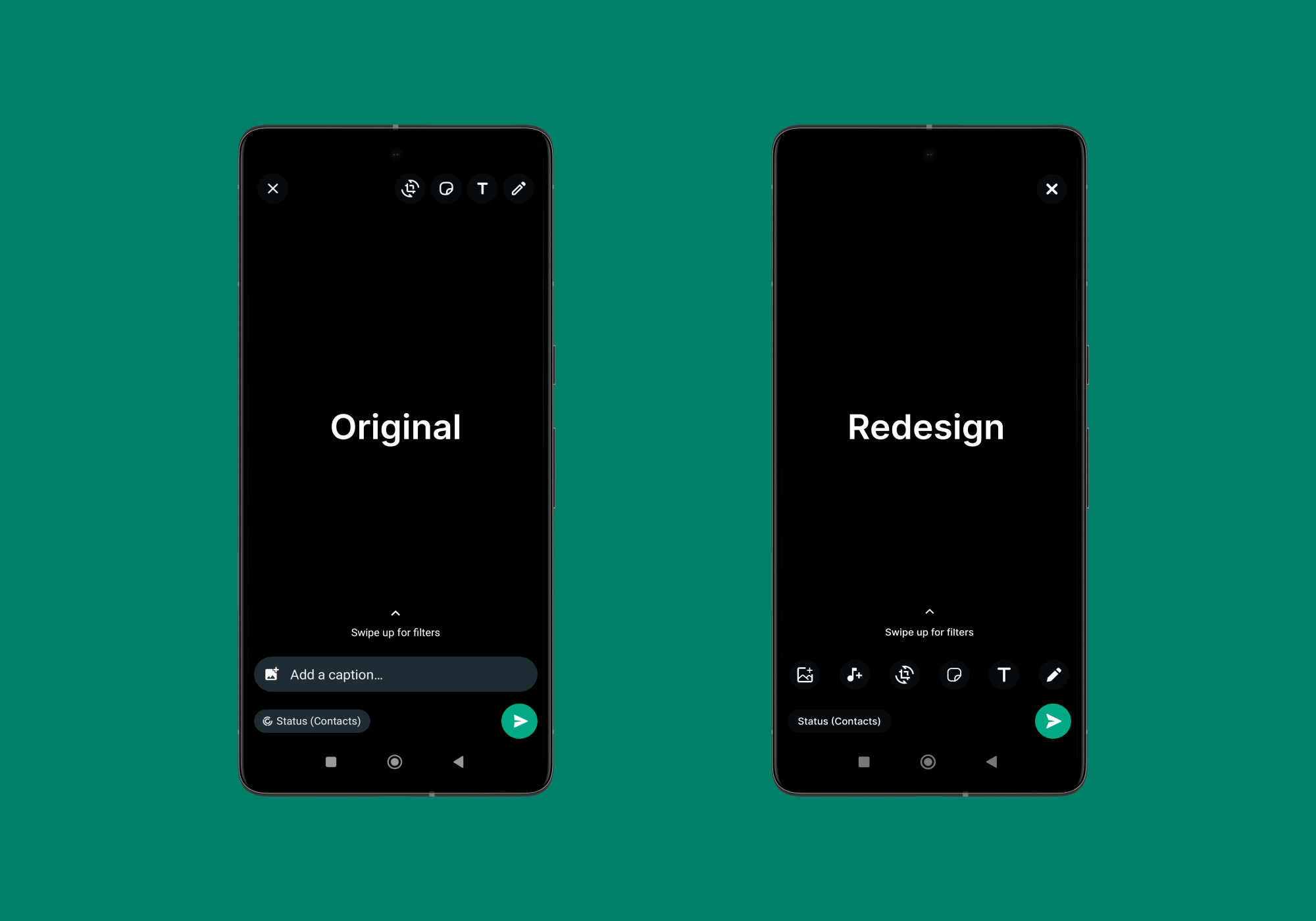
I began by analyzing the current UI of WhatsApp’s status upload screen. A few things stood out:
- All edit actions like rotate, add text, marker, and sticker were placed in the top right corner — out of reach for most thumbs.
- The close (X) button sat in the top left corner — also far from the natural hand position.
- No option to add music to the status — a missing feature compared to other social apps like Instagram.
This made the experience slower and less intuitive, especially for one-handed use.
The Redesign Goals
- Make frequently used tools more thumb-friendly
- Add a music icon to expand expressive options
- Improve the navigation flow and close interaction
The New Design
What’s changed:
- All edit icons (text, marker, rotate, sticker) were moved to the bottom of the screen. This brings them within natural thumb reach, making the interaction faster and more comfortable.
- A new music icon was added to allow users to add music clips to their status — making the experience richer and on par with competitor apps.
- The close (X) icon was moved to the top right corner — aligning with common user expectations and reducing hand movement during use.
Why It Matters
- Most users interact with mobile apps using one hand. Keeping important actions in thumb-accessible zones significantly improves usability.
- Small interaction changes can drastically impact how fluid and enjoyable a user’s experience is — especially on a screen as frequently used as WhatsApp Status.
- Adding the music feature makes the platform more expressive and competitive.
Tools Used
- UI Design: Figma
- Research: Hands-on usage, peer feedback.
Final Thoughts
This was a quick but meaningful exercise in micro-interaction improvement. Sometimes, enhancing just one screen can spark a much smoother user journey.
If you’d like to share feedback or ideas, feel free to reach out.
Thanks for reading!